If you are a traditional pastel artist, you might think having only 92 colors to paint with is just TOO sad. You probably have many more beautiful sticks of color to use if you have been working with pastels for very long. But, let me reassure you, you have more than enough color at your disposal in the 92 little pots of PanPastel colors. You can download a PDF Color Chart at
http://www.panpastel.com/colors.html
PanPastels are arranged in values. If you have ever used Rembrandt pastels, the scheme for values that Rembrandt uses is very similar to the PanPastel scheme. There are 20 pure colors in PanPastel. Each of these has a tint (very light), a shade (somewhat darker than the pure color), a pure color (true color) and an extra dark value. So really each color can be arranged in a hierarchy of 4 values. This makes it much easier to get the right values in a painting because there is less guesswork about them. Here is a picture of 4 values of Permanent Red going from the darkest value on the left to the lightest value (the tint) on the right.
I have always enjoyed limiting my palette to multiple shades of a few colors…say 4-5 colors with 5-10 values at most. So the idea of working within color constraints was not new to me. But, I had no idea which PanPastels to buy or how to create palettes that would suit me. And although I looked at all the available resources on PanPastels methods, at the time, I could not find any good instruction on how to set up a palette.
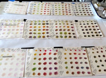
Lucky for me, I found Joyce Washor Saltzman’s e-book, Oil Painting Harmony: The Tao of the Complementary Palette (2013). In this book the author demonstrates how to create three different complementary palettes using oils. I have always preferred complementary palettes, so I felt comfortable with the limitations of these palettes. I applied her principles to the color options in PanPastels and created color charts for each palette using her methods. Her method really helped me to learn how to mix colors using the new product. Here is a picture of the color charts I created to adapt her oil painting palettes to PanPastels.
First attempt at creating color charts for Pan Pastel Palettes-since modified
If this looks complicated, don’t worry, Saltzman shows you how to create your own charts in videos in the e-book. I did have to make some substitutions because certain colors available in oils are not available in PanPastels. How you choose to substitute is really a matter of personal vision. An example of a substitution I made in the Red/Green palette follows. Saltzman uses Permanent Rose. There is no Permanent Rose in PanPastel, but there is Magenta and the colors are very close. So, I substituted Magenta for Permanent Rose. I also made choices for neutrals that were consistent with my particular vision. Of course, colors get warmer or cooler based on the color they are next to. So, making substitution choices was very much a holistic process, keeping the whole palette in mind.
Saltzman’s method is to create a palette that has a set of warm colors and a set of cool colors that are complementary. Her suggestions are red/green, yellow/violet, or orange/blue. Then each set of colors is further broken down into neutrals, cools, true color, and warms. When you mix these colors using her method, you end up with both true colors and gorgeous grays that create harmonious color throughout the painting.
Because PanPastels come in various values, I made a color chart for each true color based on values. In other words, I did a chart for the Red/Green palette for each value: mid-value (the true colors), high value (the tints of that color), low value (the shades of that color) and very low value (the darks of that color). The I did the same thing for Yellow/Violet and Orange/ Blue palettes. Over time I have made some adjustments but what a great learning experience that was!
The only thing you need to do this is some heavy paper, a full set of PanPastels (you don’t need the metallic colors, pearlescent colors or mediums), and 3-4 bags of the Mini Applicators (and Saltzman's e-book, of course). When making your chart, be sure to wipe the applicator off each time you change color. You do that by rubbing the tip across a paper towel. If you are not consistent with doing this, you will not end up with a good color chart. I went through a lot applicators because I am a fanatic about clean color. I recommend doing these charts for each palette and each value before going on to the next topic of Tools and Supports. You will have a total of 12 charts. I did 4 charts on the same sheet of paper, one for each palette. This allows me to look at all the color combinations possible for a single palette. Here are my 4 value charts for the Orange/Blue palette.
Cuurent palette is lightly modifed from this early version
If you know in advance, that you will only want to use a particular palette, say Red/Green, you will not need a full set of Pan Pastels, just the colors for that palette. But, since I didn’t know which palette would really work with my particular way of seeing, I chose to get the full set. If you have any questions about setting up a color chart, just use the "comments" section and I will respond or you can e-mail me at honeylea@honeyleagaydos.com.
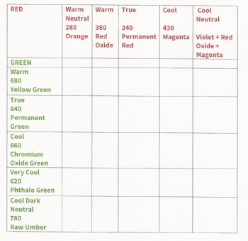
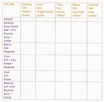
To help you see how I made adjustments to Saltzman's palettes, I am including my color charts here. Your choices may be different from mine based on your own vision. But, this will give you an idea of an approach.
RED/GREEN PALETTE
YELLOW/VIOLET PALETTE
ORANGE/BLUE PALETTE
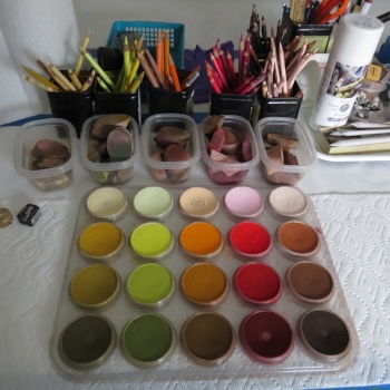
The orange side of my ORANGE/BLUE palette
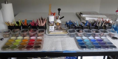
The blue side of my ORANGE/BLUE palette
The whole palette set up
