When confronted with all the beautiful PanPastel colors, it can be hard to decide what to buy. You can create gorgeous palettes with just three colors: a yellow, a red, and a blue. To be sure you paint correct values, it’s a good idea in the long run to get all 4 values of each color. So, for example, if you choose Yellow Ochre as your yellow, getting the tint (the lightest value), the true color, the shade, and the extra dark of Yellow Ochre will take the guess work out of creating paintings with accurate values from light to dark. Well, most of the guesswork, anyway.
Deciding on a consistent palette for your work has a number of advantages. First, it really helps with learning the best way to express your vision through this medium (or any medium, really). Second, using the same palette lets you truly learn how to see and create color. It’s especially helpful in demonstrating how colors work when they are next to each other on the painting surface; how colors that seem warm can go cool depending on the surrounding colors and vice versa. Three, it takes the guesswork out of choosing colors that “go together”. Some people may feel it is too limiting, but actually, having a consistent, predictable palette frees a person up to concentrate on getting all the other formal elements right. And it’s more economical to buy just what you need rather than everything that strikes your fancy. For all these reasons, I love a limited palette.
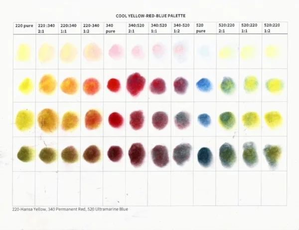
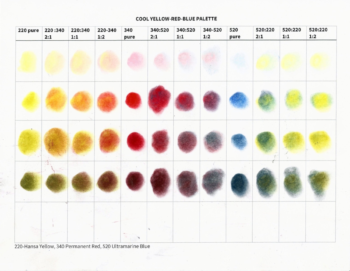
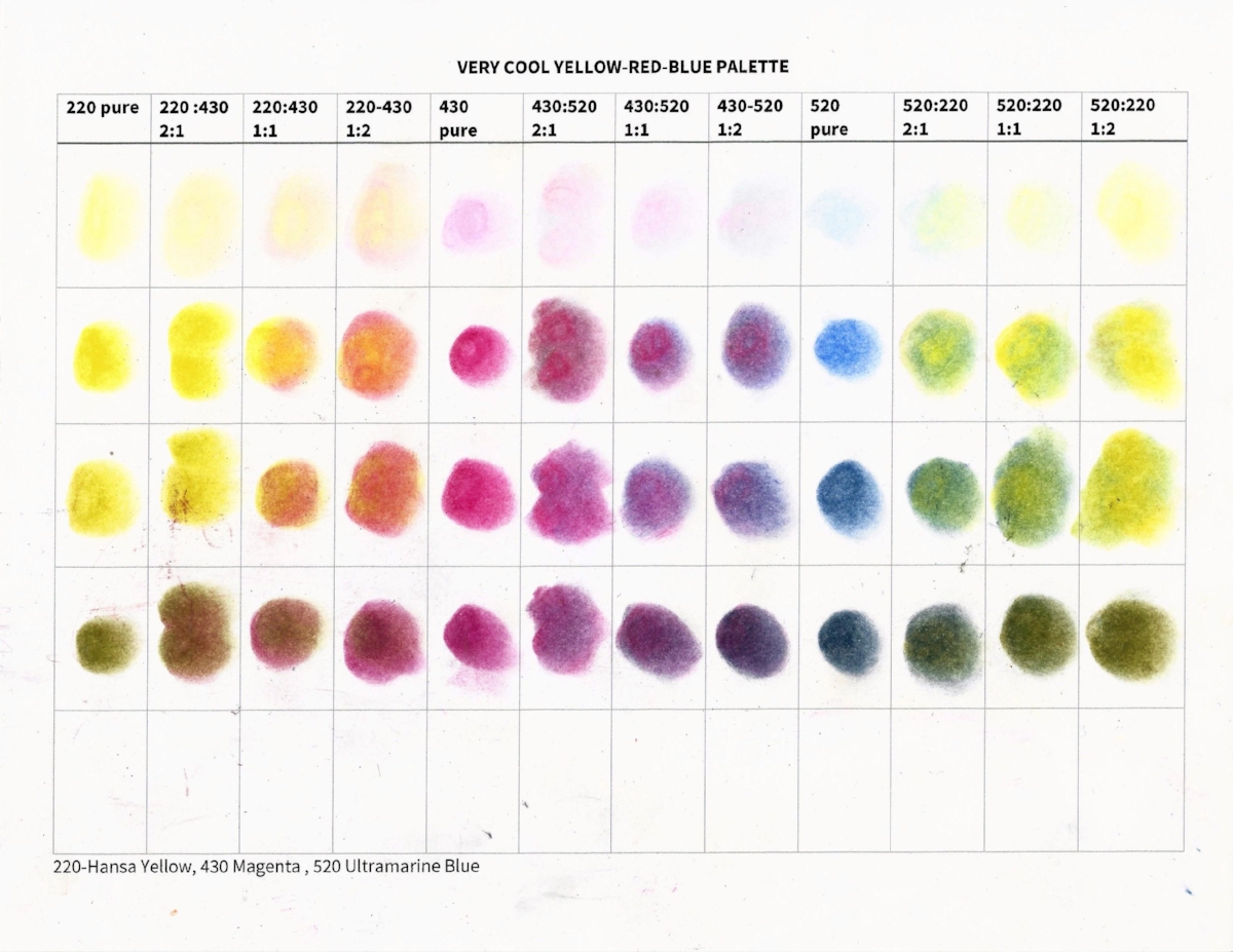
For the past 4 years, I have been using an orange-blue complementary palette of 20 colors plus black and white (See my post on “Mastering the Mix”). It’s been a great learning experience and has helped me to create a more coherent body of work to have the same palette throughout my paintings. But, recently I’ve gotten excited about trying out various 3-color palettes. So, I have made 7 color charts to explore various combinations of the yellows, reds, and blues in PanPastel. Making color charts is an easy and very effective way to decide on a palette for a particular painting or for a whole body of work.
Here are my new charts. I like them all but am leaning toward the Zorn or the Earthy for a new series of work. Take a look and see if one of these suits your vision.


